

Machine learning models can often be complex, opaque, and difficult to interpret. Understanding how a model makes decisions is crucial for debugging, improving model performance, gaining stakeholder trust, and ensuring fairness. This is where model visualization comes into play.
In this article, we will explore what model visualization in machine learning is, why it matters, the different types of visualizations available, and the tools and techniques you can use to implement them.
What is Model Visualization?
Model visualization in machine learning refers to the practice of graphically representing various aspects of a machine learning model, including its structure, behavior, decision-making process, and performance. The goal is to make complex models easier to understand, interpret, and communicate.
Visualization techniques can vary widely depending on the type of model and the problem you are trying to solve. For example, visualizing a decision tree is very different from visualizing a deep neural network.
Why is Model Visualization Important?
Here are some key reasons why model visualization is crucial in machine learning projects:
- Interpretability: Helps data scientists and stakeholders understand how a model arrives at its predictions.
- Debugging: Visualizing model behaviors can reveal errors, biases, or unexpected patterns.
- Model Improvement: Insights from visualization can lead to better feature engineering, hyperparameter tuning, and model selection.
- Transparency and Trust: In regulated industries like healthcare and finance, visual explanations are necessary for compliance and ethical standards.
- Educational Purposes: Visualizations help explain machine learning concepts to newcomers and non-technical audiences.
Types of Model Visualization Techniques
Model visualization can be categorized based on what aspect of the model you are trying to understand.
1. Model Structure Visualization
- Decision Trees: Visualizing tree splits, conditions, and outcomes.
- Neural Networks: Showing the layers, neurons, and connections.
- Model Architectures: Displaying complex model workflows like in ensemble methods or multi-input models.
2. Feature Importance Visualization
- Feature Importance Scores: Bar charts showing the importance of each input feature.
- Permutation Importance: Visualizing the drop in performance when each feature is shuffled.
- SHAP (SHapley Additive exPlanations): Detailed contribution of each feature to each prediction.
3. Prediction Behavior Visualization
- Partial Dependence Plots (PDPs): Show how a feature affects model predictions.
- Individual Conditional Expectation (ICE) Plots: Show how individual samples respond to a feature change.
- LIME (Local Interpretable Model-Agnostic Explanations): Local approximations to interpret complex models.
4. Performance Visualization
- Confusion Matrix: Visual layout of true positives, false positives, true negatives, and false negatives.
- ROC Curve and AUC Score: Visual performance of classification models.
- Precision-Recall Curves: Especially useful for imbalanced datasets.
- Learning Curves: Plotting training and validation errors over epochs.
- Loss Curves: How loss decreases over time during training.
Popular Tools for Model Visualization
Several libraries and frameworks are available to help with model visualization, each offering specialized capabilities tailored to different types of models and analysis goals. In the Python ecosystem, some tools have become particularly popular due to their versatility, ease of use, and strong community support.
- Scikit-learn: This library offers built-in plotting functions such as
plot_treefor decision trees andplot_confusion_matrixfor classification evaluation. It also supports feature importance visualization directly for models like Random Forest and Gradient Boosting. - TensorBoard: Developed by TensorFlow, TensorBoard is a powerful tool for visualizing neural network training, model architectures, loss curves, histograms, and more. It’s essential for deep learning projects.
- Yellowbrick: Yellowbrick extends the functionality of scikit-learn by offering additional visualization techniques, including feature analysis, model selection diagnostics, and residual plots for regression models.
- SHAP (SHapley Additive exPlanations): SHAP provides highly detailed, theoretically-grounded feature importance explanations. It supports visualizing both global and local interpretations, making it ideal for interpreting complex models.
- LIME (Local Interpretable Model-Agnostic Explanations): LIME offers explanations of individual predictions, generating visualizations that highlight which features contribute most to a specific prediction.
- Matplotlib/Seaborn: While general-purpose, these libraries are invaluable for custom visualizations like ROC curves, feature importances, learning curves, and more.
- Graphviz: Essential for creating clean, high-quality tree diagrams, especially for decision tree-based models. It’s often used alongside scikit-learn to generate more polished visualizations than the default
plot_treeoutput.
Examples of Model Visualization
Let’s walk through a few examples:
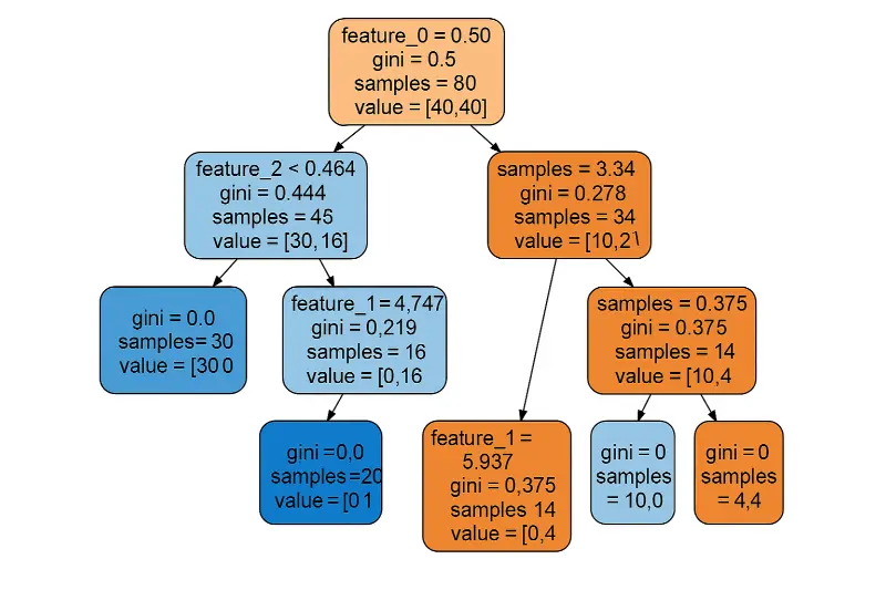
Visualizing a Decision Tree
Using scikit-learn:
from sklearn import tree
import matplotlib.pyplot as plt

clf = tree.DecisionTreeClassifier()
clf = clf.fit(X_train, y_train)

plt.figure(figsize=(20,10))
tree.plot_tree(clf, filled=True)
plt.show()
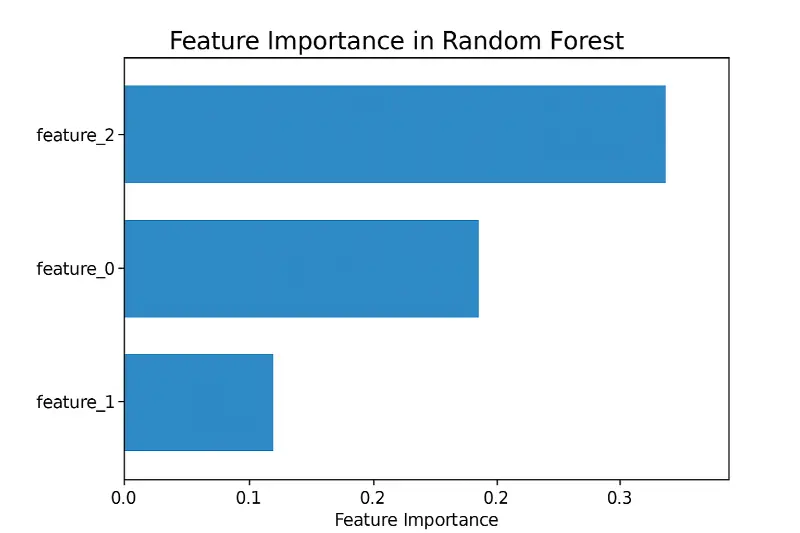
Feature Importance with Random Forest
importances = model.feature_importances_
features = X_train.columns

plt.barh(features, importances)
plt.xlabel('Feature Importance')
plt.title('Feature Importance in Random Forest')
plt.show()
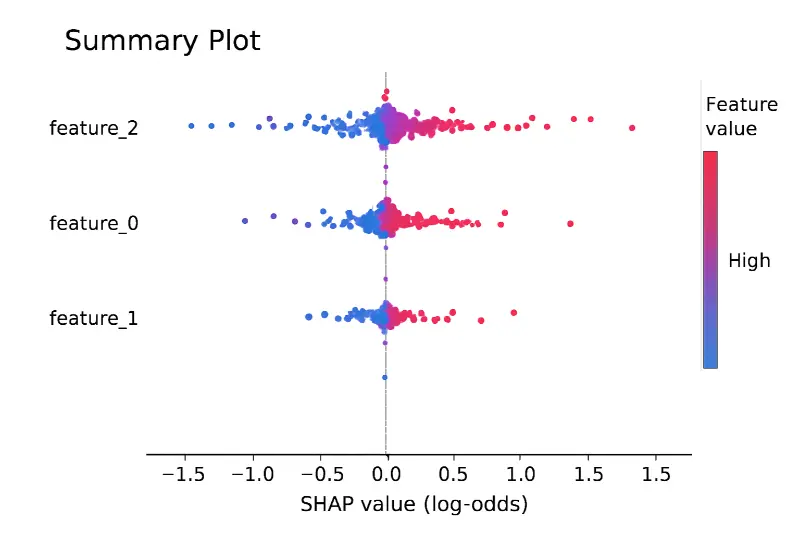
SHAP Summary Plot
import shap

explainer = shap.TreeExplainer(model)
shap_values = explainer.shap_values(X_train)

shap.summary_plot(shap_values, X_train)
Challenges in Model Visualization
While visualization can be incredibly powerful, it comes with challenges:
- Complexity: Visualizing deep neural networks with millions of parameters is very difficult.
- Over-Simplification: Visualizations can sometimes mislead if important nuances are lost.
- Computation Cost: Some interpretability methods (like SHAP) can be computationally intensive.
- Scalability: Visualizations that work for small datasets may not work for larger ones.
Best Practices for Model Visualization
Model visualization is not just about creating appealing graphics; it’s about delivering clear and accurate insights. To achieve this, several best practices should be followed.
- Audience Awareness: Always tailor your visualizations to your audience. Technical teams may appreciate more detailed plots like SHAP values or ICE plots, whereas business stakeholders might prefer simpler, high-level visual summaries like feature importance charts.
- Keep It Simple: Focus on the core insights you want to communicate. Avoid cluttering visualizations with unnecessary elements that could distract from the main message.
- Highlight Uncertainty: In real-world applications, models often make predictions with a certain degree of uncertainty. Good visualizations clearly indicate areas where the model’s predictions are less confident, helping users set realistic expectations.
- Validate Interpretations: Don’t rely solely on visualizations for conclusions. Always back up visual findings with statistical tests or other forms of validation to ensure robustness.
- Consistency in Style: Use consistent colors, labeling, and formats across different visualizations to avoid confusion and maintain a professional presentation.
- Documentation: Whenever possible, annotate your visualizations with explanations or legends so that they are understandable even without additional context. This makes your visualizations more self-explanatory and accessible.
Conclusion
Model visualization in machine learning plays a critical role in making sense of complex algorithms, ensuring transparency, improving performance, and building trust with stakeholders. From decision trees to neural networks, from feature importance to performance curves, visualizations provide an essential bridge between abstract mathematics and actionable insights.
If you work with machine learning models, investing time in mastering visualization techniques is not optional — it’s necessary. The right visualization can transform how you build, explain, and improve your models.