

Jupyter Notebook is a powerful tool widely used by data scientists, analysts, and developers for interactive computing. But did you know that you can also use Jupyter Notebook to build interactive dashboards? These dashboards can provide real-time visual insights, allowing users to explore data dynamically.
In this guide, we’ll walk you through the process of creating interactive dashboards in Jupyter Notebook using various Python libraries such as Voila, Dash, Panel, and ipywidgets. Whether you want to build a simple interactive visualization or a fully functional dashboard, this article will help you get started.
Why Create Interactive Dashboards in Jupyter Notebook?
Before diving into the implementation, let’s explore some key benefits of using Jupyter Notebook for building interactive dashboards:
✔ No Web Development Required – You can build interactive dashboards without needing to write HTML, CSS, or JavaScript. ✔ Easy to Share – Dashboards can be shared with stakeholders through Jupyter or deployed as standalone applications. ✔ Live Data Exploration – Users can manipulate data using widgets, dropdowns, and sliders. ✔ Supports Multiple Libraries – Works with Matplotlib, Plotly, Bokeh, and other visualization libraries. ✔ Quick Prototyping – Great for data exploration and storytelling before transitioning to production-level apps.
Setting Up Your Environment
To create interactive dashboards in Jupyter Notebook, you’ll need to install the necessary Python libraries. Open a terminal or a Jupyter Notebook cell and run:
pip install voila dash jupyter-dash panel ipywidgets
These libraries will enable us to create interactive components and render dashboards inside Jupyter Notebook or as standalone web apps.
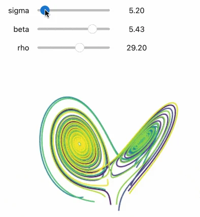
Method 1: Using ipywidgets for Simple Interactivity
ipywidgets allows users to add interactive elements like sliders, dropdowns, and buttons to their Jupyter Notebooks.
Example: Interactive Data Filtering with ipywidgets
import ipywidgets as widgets
import pandas as pd
import matplotlib.pyplot as plt
from IPython.display import display

# Sample Data
data = {'Category': ['A', 'B', 'C', 'D', 'E'],
        'Values': [10, 20, 30, 40, 50]}
df = pd.DataFrame(data)

# Dropdown Widget
dropdown = widgets.Dropdown(options=df['Category'], description='Select:')

def update_plot(category):
    filtered_data = df[df['Category'] == category]
    plt.figure(figsize=(6,4))
    plt.bar(filtered_data['Category'], filtered_data['Values'])
    plt.xlabel('Category')
    plt.ylabel('Values')
    plt.title('Category Wise Values')
    plt.show()

widgets.interactive(update_plot, category=dropdown)
✅ Best for: Quick data exploration and prototyping inside Jupyter Notebook.
Method 2: Using Voila to Convert Notebooks into Web Dashboards
Voila is a tool that turns Jupyter Notebooks into interactive dashboards without exposing the underlying code.
Steps to Use Voila
- Create a Jupyter Notebook and add ipywidgets for interactivity.
- Run the Notebook normally to check the outputs.
- Launch the Dashboard using Voila:
voila my_notebook.ipynb - This will open a web-based dashboard, hiding all code cells and showing only interactive outputs.
✅ Best for: Creating interactive reports without exposing code to end users.
Method 3: Creating Dashboards with Dash and Jupyter-Dash
Dash is a popular Python framework for building web-based dashboards. Jupyter-Dash allows Dash apps to run inside Jupyter Notebook.
Example: Interactive Dashboard with Dash in Jupyter Notebook
from jupyter_dash import JupyterDash
import dash_core_components as dcc
import dash_html_components as html
from dash.dependencies import Input, Output
import plotly.express as px
import pandas as pd

# Sample Data
df = px.data.gapminder()

# Initialize Dash App
app = JupyterDash(__name__)

app.layout = html.Div([
    dcc.Dropdown(
        id='country-dropdown',
        options=[{'label': country, 'value': country} for country in df['country'].unique()],
        value='United States',
        multi=False
    ),
    dcc.Graph(id='line-plot')
])

@app.callback(
    Output('line-plot', 'figure'),
    [Input('country-dropdown', 'value')]
)
def update_chart(selected_country):
    filtered_df = df[df['country'] == selected_country]
    fig = px.line(filtered_df, x='year', y='gdpPercap', title=f'GDP Per Capita of {selected_country}')
    return fig

# Run App
app.run_server(mode='inline')
✅ Best for: Creating full-fledged interactive dashboards with advanced customization.
Method 4: Using Panel for Flexible Dashboarding
Panel is another powerful library that allows you to build interactive dashboards using widgets and visualizations.
Example: Panel Dashboard with Matplotlib and Sliders
import panel as pn
import numpy as np
import matplotlib.pyplot as plt

pn.extension()

# Function to update plot
def plot_function(frequency=1.0):
    x = np.linspace(0, 10, 100)
    y = np.sin(frequency * x)
    plt.figure(figsize=(6,4))
    plt.plot(x, y)
    plt.xlabel('X-axis')
    plt.ylabel('Y-axis')
    plt.title(f'Sine Wave with Frequency {frequency}')
    plt.grid()
    return plt.gcf()

# Create Panel App
freq_slider = pn.widgets.FloatSlider(name='Frequency', start=0.1, end=10, step=0.1, value=1)
pn.interact(plot_function, frequency=freq_slider).servable()
Run the following command to launch the Panel app:
panel serve my_dashboard.ipynb --show
✅ Best for: Users who prefer a more flexible approach with minimal setup.
Conclusion
Creating interactive dashboards in Jupyter Notebook is easy and powerful, thanks to libraries like ipywidgets, Voila, Dash, and Panel. Depending on your needs:
- Use ipywidgets for simple interactivity inside notebooks.
- Use Voila to turn notebooks into standalone web dashboards.
- Use Dash (Jupyter-Dash) for creating robust web applications.
- Use Panel for highly customizable and flexible dashboards.
By leveraging these tools, you can build dynamic, interactive, and shareable dashboards without the need for extensive web development expertise.
Now, it’s time to create your own interactive dashboard in Jupyter Notebook. Which method will you try first? Let us know in the comments!